Tooltips for Jetpack Compose: Improve User Experience to the Next Level
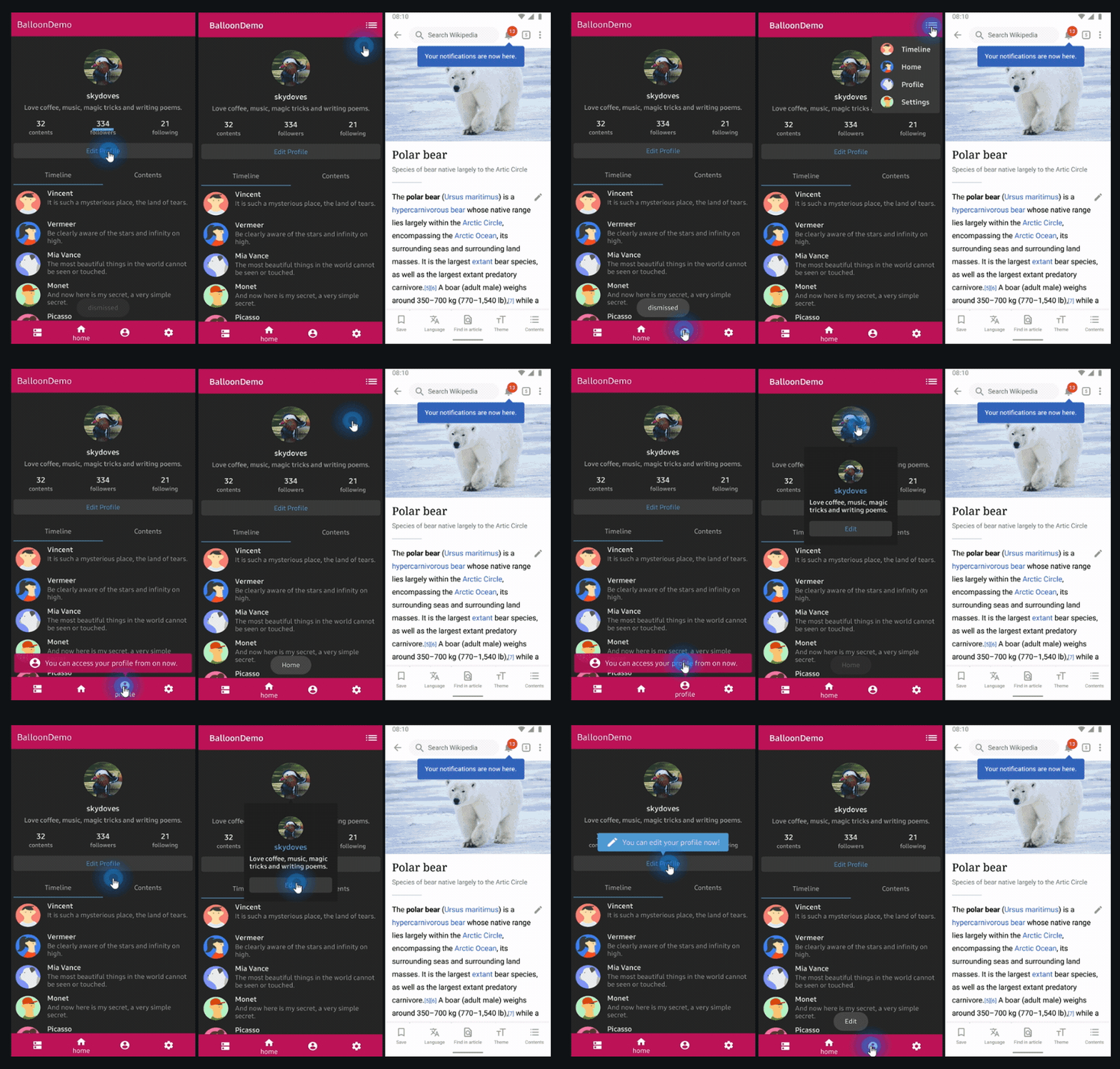
Tooltips are one of the most commonly used features in modern mobile development to improve user experience. It can be a good strategy to increase user engagement by pointing out specific areas, guiding screen flows, and giving useful information to application users. This post will show you how to implement tooltips in Jetpack Compose using Balloon.

What is Balloon? 🎈
Balloon is an open-source library to implement modernized and sophisticated tooltips for Android, and you can fully customize the content, position, arrow, animation, lifecycle-aware behaviors, and most window actions.

It was released in 2019, and now it hits +300,000 downloads every month from many global products including PayPal, Wikipedia, WazirX, and MyJio. If you’re interested in listening to a podcast about the history of Balloon, check out the The Developers’ Bakery — Balloon with Jaewoong Eum.
Balloon in Jetpack Compose
Since version 1.5.0, Balloon has started to support Jetpack Compose, which means you can configure the body contents with a Composable function. Fundamentally Balloon is built with PopupWindow, so all window behaviors are 100% compatible with Jetpack Compose and it works the same way to show and dismiss windows, and observe lifecycles.
Gradle Setup
Before getting started, import the balloon-compose package into your project. Add the dependency below to your app level build.gradle file:
Note: To see the latest version of the library, check out the GitHub releases page.
rememberBalloonBuilder
First, you need to configure the tooltip’s orientation/size/position of the arrow, padding, background color, paddings, animations, overlays, listeners, and whatever, following your team’s design guide or your taste. In Jetpack Compose, you can create a builder of Balloon using the rememberBalloonBuilder method like the below:
You can set the width/height size, alpha, color, background, animations, paddings, margins, preferences, listeners, and everything that you need to customize the balloon.
rememberBalloonBuilder is based on the remember API in Jetpack Compose so it will store the builder instance in the Composition, and you can’t modify it when you once create it.
For more information about Balloon.Builder, you can check out the README file and documentation.
Balloon Composable
Now you can display your tooltips with Balloon composable function like the below:
As you can see in the code above, you should wrap the composable that will be an anchor using the Balloon composable function. So the tooltips will be shown up based on your anchor composable when you display tooltips using showAtCenter, showAlignTop, showAlignBottom, or whatever.
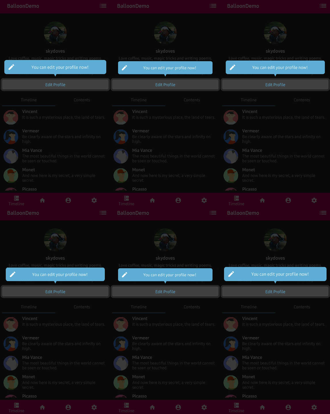
For example, if you want to highlight specific areas when you display the tooltips like the image below, everything (the position of the window, arrow, and overlay) works based on the anchor composable, because they will be calculated by measuring the layout size of your anchor composable.

You can implement the body of tooltips by implementing your composable into the balloonContent lambda parameter. Basically, the size of the content is following the balloon, so you need to check if you set sizes properly in the rememberBalloonBuilder block.
For example, if you want to wrap the content width and height, you should also set the size rules for the balloon like the below:
BalloonWindow
BalloonWindow is an interface that defines all executable behaviors of the balloon's window, such as showing, dismissing, updating, and setting listeners. You will get an instance of BalloonWindow inside of the content lambda parameter of the Balloon composable function like the below:
So potentially you can control all executable behaviors of Balloon with the BalloonWindow. There are many use cases to handle BalloonWindow . For instance, if you want to control your tooltips outside of the Balloon composable, you can utilize the concept of State and LaunchedEffect like the below:
As you can see in the code above, you can define your own events to control the BalloonWindow and you can perform the behaviors with LaunchedEffect whenever the balloonEvent state is changed.
You need to keep in mind that, you must reset the state whenever the balloon is dismissed with setOnBalloonDismissedListener and LaunchedEffect as you can see in the example above.
For more details on methods, check out the documentation and if you want to learn more about the LaunchedEffect, check out the Side-effects in Compose.
Compose Extensions
Balloon supports some useful extensions for Jetpack Compose, such as setting background, arrow, body colors using androidx.compose.ui.graphics.Color like the below:
Note: Those extensions are only work for the default form without your custom content. If you want to use the default form of balloon (icon + text), you should pass a null value to the
balloonContentparameter of your Balloon composable.
Avoiding Memory leak
Dialog, PopupWindow and etc.. have memory leak issues if not dismissed before activity or fragments are destroyed. So when you use Balloon in XML, you must set the lifecycles with the setLifecycleOwner method to avoid memory leaks. But in Jetpack Compose, Balloon composable follows the lifecycles of your anchor composable automatically, so you don’t need to specify the lifecycles when you create a builder class.
Conclusion
In this post, you saw how to implement tooltips in Jetpack Compose with Balloon that can improve your user experience in some ways.
Remember: Balloon is an open-source repository, so anyone can contribute to improving the code, documentation, or submit feature requests.
You can find the author of Balloon on GitHub at github/skydoves with any questions or feedback.
As always, happy coding!
— Jaewoong
