
Customizing Android Popup Spinner (Dropdown List) with Animations
Spinner is one of the most frequently used widgets in Android for selecting a specific item in a dropdown list. The Android SDK provides a default widget called Spinner, but as we know it requires many kinds of boilerplates and difficult to fully customize for our preferred design. And no animations. This requires our valuable time whenever we need to create a different type of spinners based on preferred designs. In this post, we will take a look at how to customize a better Spinner using a library, PowerSpinner.

The library PowerSpinner was invented for providing easier customizing options and flexibility in such kinds of different environments. Thankfully this library has been downloaded from the hundreds of thousands of Android projects, and new issues are continuously being solved. You can check the newest release here.

Including in your project
Let’s begin to include the library in our project. We need to add the below dependency in our build.gradle file.
dependencies {
    implementation "com.github.skydoves:powerspinner:1.2.4"
}
PowerSpinnerView
PowerSpinnerView is the main in this library, it could be used like TextView. We can set the default text and text color using the android:hint and android:textColorHint attributes. Also, we can use custom attributes for customizing based on our needs. We can customize using more than 20 attributes related to PowerSpinner.
Setting up Items
Setting up items on the list is one of the important specifications for Spinners. We can set items in two ways.
- Resources
If we have to set up immutable string items for our list, this is the most preferred way. Make a string-array on your strings.xml resource file, and use thespinner_item_arrayattribute in the XML layout.
Or we can set the items in runtime using the setItems method.
spinnerView.setItems(R.array.questions)2. Dynamically
We can add a string list dynamically in runtime like below. If we have to set up items after getting a response from the network, local database, or etc, this is a good choice.
Show and dismiss
Basically, the dropdown list will be shown if the PowerSpinner is clicked, and it will be dismissed if an item in the list is selected. But If we want to show or dismiss manually, we can use the following methods.
And we can change the basic behaviors of the dropdown list using the following methods.
Focusable
Have been asked several times before about this problem, so I come to mention it. Basically, PowerSpinner does not be dismissed when we touch outside, which means we can show multiple PowerSpinner at the same time. But If we want to dismiss the previous one before showing another one, we can implement it using the following method.
binding.spinnerView.setIsFocusable(false)OnSpinnerItemSelectedListener
We can listen to which item is selected by users using the listener, OnSpinnerItemSelectedListener. The listener gives us four parameters for using them after selected an item: oldIndex, oldItem, newIndex, newItem .
Select an item by an index
We can select an item manually at any time using the following method.
powerSpinnerView.selectItemByIndex(2) // select an index `2`Store and restore a selected position
We can store and restore a previously selected position automatically. And If we select an item, the position will be selected at the initial time automatically.
powerSpinnerView.preferenceName = "country"Or we can set it using an attribute in XML layout.
app:spinner_preference_name="country"SpinnerAnimation
PowerSpinner provides some kinds of animations when showing the dropdown list. The default is no animations. (SpinnerAnimation.NORMAL)

There are four kinds of animations, (normal, dropdown, fade, bounce). We can set the animations on our XML file.
app:spinner_popup_animation="bounce"IconSpinnerAdapter
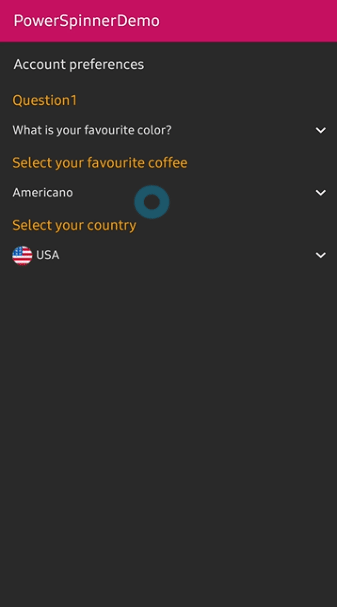
PowerSpinner provides another custom adapter called IconSpinnerAdapter . We can implement a list that items have an icon like the below screenshot.

We need to set the IconSpinnerAdapter and LayoutManager. And add items using the IconSpinnerItem class.
We can customize the following attributes of the IconSpinnerAdapter.
Custom adapters
We can make our custom adapter for customizing layouts of the item via the following steps.
- Create a custom Model
Firstly, create our own model for use in our customRecyclerView.AdapterandRecyclerView.ViewHolderlike aIconSpinnerItem. - Create an Adapter and ViewHolder
3. Set adapter and listen to the selected item
PowerSpinnerPreference
We can use PowerSpinner on the PreferenceScreen XML for implementing setting screens.
For implementing it, we need to add the below dependency in our build.gradle file.
dependencies {
    implementation "androidx.preference:preference-ktx:1.1.1"
}
And we can use the PowerSpinnerPreference in our preference XML file.
We don’t need to set preferenceName attribute and OnSpinnerItemSelectedListener should be set on PowerSpinnerPreference.
Conclusion
We explored how to implement a custom Android Spinner using a library, PowerSpinner. Spinner is one of the longest widgets in Android. (It has been added since API level 1) But every time different environments require different designs, and we’ve got stress to implement the different specifications. I hope this library could reduce our development time and make our products better. 😄You can get more information at the below link. Thanks for reading!

